JK Rowling has a new site. Rowling goes digital.
Right now there's not much on it but come October she's promising lots of exciting stuff for her old and new readers--extras, backstories, and a chance to enter Harry's world. This is what she has to say: “It’s a great way to give something back to the fans. I still receive a huge amount of stories, drawings and ideas and the site is a great way to continue the conversation.”
Also, this site will be the only place where readers can purchase digital versions of the Harry Potter books. Rowling says that ebooks are here to stay. Lucky for her, though, that she gets to solely control how much each book costs. We other authors don't get to control percentages of each book that goes into our pocket. Perhaps that's why I'm not so rah-rah about the whole thing quite yet (among other reasons).
Wednesday, June 29, 2011
POTTERMORE
Labels:
ebooks,
Harry Potter,
JK Rowling,
Pottermore
Tuesday, June 28, 2011
BORDERS IS..NOT...DEAD... YET.
Last week Borders's bankruptcy meeting was held before a judge to prevent the closing of 50 of its stores. Borders will now pay 1 million dollars for an extension to maintain its base while it looks for a potential buyer. The judge said “I’ll approve it with reluctance. I think you’re getting raped is the best way I can describe it. The other side of the coin is, it’s the only game in town. It’s very close to me saying no.” Borders told the judge that if it did not get an extension then it would be faced with immediate liquidation.
I love how some judges describe things. They can make mundane things seem way more interesting.
Thursday, June 23, 2011
DOES AUTHOR APPEARANCE MATTER?
I have an article posted on "Guide to Literary Agents" on the topic of appearance. I wrote it a long while ago but I guess I feel the same way. The very first book I published I had my photo on the back but I've never done it again. If my editor asked me I'd have my photo posted but no one has really asked. There isn't enough room because they'd rather advertise my other books on the flap. I will say that thanks to the prednisone I'm on my face gets puffy sometimes and that makes me insecure so I'd have to use a photo pre-prednisone.
What I question in my article is does appearance matter? Does it change how you feel about the book or the author? Is it better to not have a photo? I always think it's funny to see Shell Silverstein's photos because he looks a little scary. Then there are the photos that are clearly when the author was like 20 years younger.
Check out my article and make a comment. A free book goes to a random commenter! Of course you can always comment here as well.
Monday, June 20, 2011
THE RUNAWAY BEARD
This is a fun little story -- Dad shaves off his beard and tries to "hang" with the boy but finds that the beard doesn't really belong on his young face so the beard must find a new home, finally ending up on his bald uncle's head - but what I really love about it is the art and design. PLUS it comes with a beard!
Published in 1998.
Published in 1998.
Labels:
BOOK DESIGN,
book review,
The Runaway Beard
Friday, June 17, 2011
A KID'S TOUR OF HER BOOKSHELF
I looked on YouTube and there are a lot of bookself tours and a lot of kids doing it. Here's an example:
I cracked up when she gets interrupted half way through and puts the camera down. YouTube is so funny. Hmm, I don't see any iPad or Nook book tours yet. Gee, I don't think there will be. Not quite the same!
This gives me the idea to do my own. I'll try to make it good!
I cracked up when she gets interrupted half way through and puts the camera down. YouTube is so funny. Hmm, I don't see any iPad or Nook book tours yet. Gee, I don't think there will be. Not quite the same!
This gives me the idea to do my own. I'll try to make it good!
Thursday, June 16, 2011
WEIRD CHILDREN'S BOOK ALERT!
Wednesday, June 15, 2011
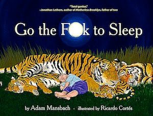
GO THE F TO SLEEP A COPYCAT?
I saw this circulating digitally about a month ago. I must have gotten it two or three times in the same day from different people. It was a link or PDF and I was able to read the whole book. Then, the other day, I saw the book on one of the main tables on the first floor at Barnes and Noble in Union Square.
It's a parody of various children's books - and a parody of parenting in general - basically - why won't the kid just go to sleep! I thought the joke went on a little too long. I got it on page two. This is my personal opinion of course. At any rate, I just read that there's another book that people are claiming to be the original inspiration for the book:
(Image from It's Time To Sleep, My Love)
The author of "Go the F to Sleep" is claiming that he knows nothing of this book. It is true that many themes come up again and again and coincidences happen. Although, the two images are very similar. I say, if it was your inspiration own it! Parodys are legal. I've seen multiple Good Night Moon inspirations.
All I'm saying is, if you did something on purpose, then own up to it. If not, then I guess just keep doing what you're doing.
I read one comment that said that a reader hoped that this book wouldn't get shelved in the kids' section. If it did, she said it would be awful. I suppose so, though the F word is never used and booksellers SHOULD be careful!
Labels:
Go the F to Sleep,
It's Time To Sleep,
My Love
Tuesday, June 14, 2011
A GREAT RENDITION OF A BOOK BY A YOUNG READER
Friday, June 10, 2011
UNIQUE DESIGN
This is what I aim for - a whole package with each book. Sometimes it's hard to do because these things cost more, but each little thing is worth it in my mind. And once again, this is something you can't get on an e-book. I appreciate the package too much to ever say goodbye.
Labels:
BOOK DESIGN,
book jackets,
chip kidd,
ebooks
Thursday, June 9, 2011
WHAT KIDS NOTICE
Kids are amazing. I got a letter from a teacher in MD. It reads:
"Dear Ms. McCarthy,
Enclosed you will find a letter written by one of my fourth grade students, Cassidy Krebs. This week, as I was reading your book Pop! The Invention of Bubble Gum to her class, Cassidy noticed a discrepancy in the illustration on page 22. I as pointing out to the class how the illustration was showing the passing of time by the falling away of pages of the calendar. Cassidy pointed out that the pages were in the wrong order. The rest of the class concured and Cassidy was determined to write to you and point this out. Attached is her letter."
This is the spread in question:
Yes, I did indeed put them in the wrong order! Did I do this on purpose? Mmm, I'd like to say "yes," because sometimes I do things like that on purpose to see if anyone will notice but this time I did not. The only way the pages could fall like that is if they fell from behind the one that reads "1" which isn't likely. So Casidy is right! I'm going to send her a painted drawing for her keen observation. Illustrators make mistakes! Let's home I keep them to a minimum. I think it's great that I get letters like this though. Keep them coming!
Wednesday, June 8, 2011
WHICH MONSTER CAME FIRST?
I came upon a book a long time ago at the Strand in a pile of used books. IT was called THE MAN WITH THE CAN - the art of Jan Sanders. He was born in 1919 in the Netherlands.
When I flipped through the book I immediately got stuck on this image. I knew this picture!
(the date on it says 1972)
It was extremely similar to ONE MONSTER AFTER ANOTHER (1974):
It seems to me that Mercer Mayer had seen Sanders's cartoon and either consciously or unconsciously decided to make an image similar. Was it a joke? An insider joke? Was Sanders's work really popular at the time - a joke that many adults would recognize? Or did he see the image somewhere and file it away and then think it was his own? Either way I love both images!
Labels:
cartoons,
Jan Sanders,
Mercer Mayer,
One Monster After Another
Friday, June 3, 2011
ipod and ipad confuse children because of the use of "i"
This is halarious... and sad. I found this on a blog and the article is called "I think Apple is affecting children's grammer."
"I want to relate an interesting story my brother told me the other day about one fascinating -- and negative -- way Apple is affecting children in the classroom. My brother is a grade school teacher, and recently he's noticed an alarming trend in his students' grammar, specifically capitalization. It started a few years ago. My brother would review a sentence one of his students wrote, and it would read, "i went on a walk with my mom.
One day last week, when his students had turned in their short story assignments, my brother graded them over recess and noticed that the dreaded lowercase "i" was incorrectly capitalized in more papers than ever. When his students came back from recess, he asked them why so many of them weren't capitalizing their I's, even when they began a sentence with the pronoun "I." The first reply: "Because iPod is spelled that way." The other children agreed that's why they do it as well, though some attributed it to the iPhone or iPad.
That's when my brother realized it's hard for seven, eight and nine-year-olds to understand the concept of branding and marketing (but not advertising), and therefore it's hard for them to make the connection that "iPod" with a lowercase I is capitalized correctly, but "i am going on a walk" is not. He also realized it's now an uphill battle to teach young children the proper way to use capitalization when most of today's popular electronics begin with a lowercase I."
You can read the whole blog post by clicking on the article title at the top. This sure is something! Kids are spelling other things wrong as well, points out the blogger -- thanks to brand names deliberately spelled wrong. Oh, America. What shall we do!
On another Apple topic, I broke my iPod touch today. It fell out of my bag when I was getting out of the subway and although it was in a case it fell out of that (just a cloth one I got off of Etsy) and it fell onto the nice hard ground. The glass cracked all over the place. The thing still works but I had to put clear plastic tape over the top so that the glass wouldn't fall off. I don't think it'll last for much longer. One mishap and my 400 dollar iPod is gone! And I wonder -- what makes people think that their 3 and 4 year olds can handle an iPad? One drop and that glass top is gone! Since I work as a cashier I see the glass shattered tops all the time when people put down their electronics to pay. It's a big problem. Apple: plastic perhaps? Something less shatterproof? If you want to go into the children's market you need to think childproof here! One more reason to buy a book I say. That and the fact that kids don't know how to capitalize anymore.
Thursday, June 2, 2011
ALPHABET ANTICS
I've had this since I was a kid. I think my aunt gave it to me to learn cursive. I don't know where she got it from it's old!
THE ZANER-BLOSER COMPANY
HANDWRITING SPECIALISTS
COLUMBUS OHIO
COPYRIGHT 1955
I just love looking at the way old books were designed and the fonts that were used.
Also... do you think cursive writing will soon be dead?
THE ZANER-BLOSER COMPANY
HANDWRITING SPECIALISTS
COLUMBUS OHIO
COPYRIGHT 1955
I just love looking at the way old books were designed and the fonts that were used.
Also... do you think cursive writing will soon be dead?
Labels:
alphabet antics,
BOOK DESIGN,
learning cursive
Wednesday, June 1, 2011
PIANO STAIRS
This is really amazing! Just to see it made me laugh. And smile. And I wish everything was like this.
Sorry for not posting in a bit. Work (not children's books) has gotten me in a tizzy. One of these days I will find a way out of the part time job I swear!
Subscribe to:
Posts (Atom)