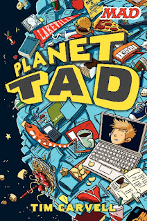
I'm posting a few covers that I've encountered lately. First are the covers that caught my eye for good reasons. I think they're eye catching. Fun. I think kids will want to pick up these books:
AWESOME COVERS
This cover is a lot of fun. The yellow font is really bold and the font is an exciting and excellent choice. The comics in the background blend right in but at the same time jump out. I want to pick this one up. It says POW! to me.
This book's font is nice and crazy. It's reminiscent of the old comics, with the drippy type. And, of course, the cooky comic characters are great. I don't know what's happening on the cover but all sorts of craziness is going on. I want to know what it is! All sorts of wildness is a' happening.
This cover utilizes only three colors: Black and white and pink, yet it does it so well. The title says HOW TO ROCK BRACES but the cover itself really rocks. It's loud but not too loud - it's fun at the same time. The lines in the background contain some edgy ones, some round, bubbly ones, and some long swoopy ones--that combination balances out this cover and the starburst containing the title really grab you. I want to know what this book is about.
This cover is different from the others. It's dark and moody. What really works is the perspective of the drawing: the characters are coming toward the viewer. They're walking from the light into the darkness. The viewer will look closer and think: What IS that darkness? This technique makes the cover intriguing. And, if you look closely, on the left side you'll see that there is a shadowed figure lurking... and then on the right? That makes things even more intriguing. And you'll also notice that the orphans are ready for a fight. The font fits nicely. It doesn't compete too much with the art. What's most important here is that the art causes a lot of intrigue and that's what works here.
BORING COVERS
Here we have the covers that I'm not so fond of. I think they're boring. The first one doesn't say anything about a "war" of any kind. It's a very stereotypical clip art school desk with a wooden kid in freeze frame. Boring!
This one. Boring! There's no movement on this cover. The central figure is very small and still. The boldest thing on the cover is the author's name and the big yellow circle. I'd see this book and think, "Eh."
This book series looks like clip art gone bad... like what lemon things and glasses and bells can I throw on a white surface and make it stick. I'm not sure why a kid would want to pick these books up. The multi-colored type is really bad too. Blah.
On this cover I see keys and strings and whiteness. Boring. Blah! It seems that they tried to jazz it up by using brightly colored fonts in different colors with a bright circle, all matching the strings. This technique was used in the above lemonade books. It doesn't work. Blah.


No comments:
Post a Comment